Section 9: Return/Risk ratios of various Asset Allocations.
Elaboration of Section 9
This section provides a powerful, data-driven visualization of a core principle introduced in Section 3: that strategic asset allocation is the primary driver of a portfolio's risk and return profile. It uses a specific chart to demonstrate that the relationship between risk and return is not always linear and that adding a "risky" asset to a "safe" portfolio can sometimes improve both its return and its risk characteristics.
The core of the argument is built around the analysis of a specific chart that plots different stock/bond mixes:
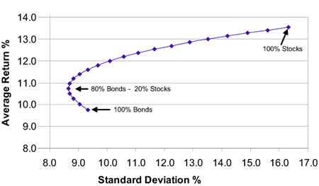
1. The Chart's Core Message: The Efficient Frontier
The chart illustrates what financial theory calls the "Efficient Frontier." It shows all the possible combinations of stocks (S&P 500) and bonds (a mix of Treasury notes and bonds) from 100% bonds to 100% stocks, and plots the resulting average annual return against the portfolio's risk (volatility).
2. The Counter-Intuitive "Sweet Spot"
The most critical insight from the chart is the non-linear relationship between risk and return at the conservative end of the spectrum.
The 100% Bond Portfolio: This is the starting point. It has a certain level of risk and a corresponding return.
Adding a Small Amount of Stocks (e.g., 20% Stocks / 80% Bonds): Here is the revelation. The chart shows that this 80/20 portfolio does not simply sit halfway between the two extremes. Astonishingly, it can achieve:
A higher potential return than the 100% bond portfolio.
The same, or even a lower, level of risk than the 100% bond portfolio.
3. Why This Happens: The Power of Diversification
This phenomenon occurs because stocks and bonds often do not move in perfect sync (they have low correlation).
When stocks are performing poorly, bonds often hold their value or even increase (e.g., during economic recessions when interest rates are cut).
This stabilizing effect from bonds reduces the overall volatility of the portfolio. Adding a small amount of stocks boosts return without proportionally increasing the portfolio's wild swings, thus improving its risk-adjusted return.
4. The Law of Diminishing Returns on Risk
The chart also illustrates another key lesson: at the aggressive end of the spectrum, taking on more risk yields smaller benefits.
As you move from 60% stocks to 80% stocks to 100% stocks, the curve begins to flatten.
This means you are taking on significantly more volatility for each additional unit of potential return. An investor holding 100% stocks is bearing a much higher risk of short-term loss for a return that may not be proportionally much higher than a 60% or 80% stock portfolio.
5. The Practical Application: How Much Risk Should YOU Take?
The section concludes by linking this data back to the personal factors from Section 2. The "optimal" point on the chart is different for everyone and depends on:
Risk Tolerance (What you can take): Your emotional ability to withstand portfolio declines without panicking.
Required Return (What you need to take): The return necessary to meet your financial goals (e.g., retirement income) after accounting for inflation.
Time Horizon: As noted, risk decreases over time. A long time horizon makes a higher stock allocation more viable.
Summary of Section 9
Section 9 uses a powerful chart to demonstrate that a strategic mix of stocks and bonds can create a portfolio that offers a better return for the same level of risk—or even lower risk—than a 100% "safe" bond portfolio.
Key Finding: A portfolio of 80% bonds and 20% stocks was shown to have a higher return and similar or lower risk than a portfolio of 100% bonds. This defies the simplistic notion that more return always requires more risk.
The Cause: Diversification. Because stocks and bonds often react differently to economic conditions, they smooth out each other's volatility when combined.
The Warning: The benefits of adding more stocks diminish at the high end. Moving from 80% to 100% stocks adds a lot of risk for a relatively smaller potential increase in return.
The Personal Decision: Your ideal spot on this risk-return curve is not determined by the market, but by your personal risk tolerance, required return, and time horizon.
In essence, this section provides the mathematical proof that a thoughtfully allocated portfolio is not just a good idea—it's a fundamentally more efficient way to invest. It convincingly argues that being 100% in bonds, often seen as the ultimate safe haven, is actually an inferior strategy for most long-term investors.