How To Pick Dividend Growth Stocks – A Fully Revealed Model
KEY IDEAS
- An explanation of what dividend stocks can help you accomplish.
- 5 steps to better dividend stock investing.
- How to use the quadrant strategy.
Editor Note: This is a guest post from Mike who manages dividend growth stocks portfolios. (affiliate link) He reveals his entire dividend stock investment model for free in this extremely valuable, educational article. It is a complete system for dividend growth stock selection. Take it away Mike…
I started investing back in 2003 when the bull market made everything easy.
Between 2003 and 2006, I made enough money to buy my first house with a 25% down payment. Those were the good years.
While I spent numerous hours in front of my computer analyzing trends and company fundamentals to become a successful investor, many other investors just picked stocks based on the news and made almost the same returns. The economy was booming, and we were able to find stocks doubling within the year.
Then 2008 Happened
I was somewhat lucky when the 2008 bear market occurred because most of my investments were cashed out in 2007 to buy my second house. Even though I was still hit by a -27% drop in my portfolio, the total dollar loss wasn’t too bad because my account was much smaller.
Anyway, I was too busy working my way up the corporate ladder and completing my MBA to worry about it. I didn’t have much time to invest my money.
From 2003 to 2008, I had a very aggressive investing model making a few trades per month on average. I was fast on pulling the buy and sell trigger in order to generate more profit.
But after 2008, the game changed and I didn’t have enough time to continue with my original investing plan. Plus, losing 27% of my portfolio in one quarter had left a sour taste in my mouth. This is what drove me, in 2010, to develop the dividend investing strategy I share with you here.
How I Developed My Own Dividend Growth Model

Over the past 4 years, I’ve continuously tweaked my dividend investing strategyto achieve two goals:
- Build a powerful portfolio– able to generate both capital and dividend growth
- Keep it simple but efficient– I wanted to build a simple investing system that works consistently
I’ll tell you upfront, I don’t hold the key to becoming a millionaire through dividend investing. I still make mistakes, but they are rarer and smaller than most investors. This is how I was able to beat the market in 2012 & 2013 with my dividend stock picks.
In 2012, I wrote a very popular book about dividend growth investing, Dividend Growth: Freedom Through Passive Income , and received hundreds of emails. People wanted to take charge of their investment portfolio because they were upset about their advisors’ inability to answer their questions and/or the high fees they were paying. And while I received many different questions, two main points kept coming up:
- The lack of time to build and manage a solid dividend stocks portfolio
- A systematic method for buying and selling dividend stocks.
This is when I realized that I had battled with the same issues and found a way to solve these two essential investing problems. Over the past four years, I’ve worked on an investing strategy that doesn’t take me forever to apply and tells me when to buy and when to sell stocks.
Below I will share that same dividend growth model with you. It’s the same model I’ve used that has performed so well over the past few years.
A Dividend Growth Model That Works
As I’ve previously mentioned, my investing strategy is built on a simple but efficient model. It is relatively straightforward and easy to implement, but it requires discipline. That is the success of my strategy.
Let me break it down step-by-step for you:
Step 1 – Start with Stock Filter Research
I start the investment selection process with a stock filter. I use a paid subscription to Ycharts (no affiliate link here) as it provides an enormous quantity of information. But you can achieve almost the same results with a free stock filter called FinViz.
FIN VIZ stock filter doesn’t provide the 5 year dividend growth metric. This is one of the reasons I use Ychart (and the fact that I can create multiple charts to compare several metrics at the same time!) But if you prefer the free way, you can still select other metrics to pick stocks that will show great dividend growth. Below are the metrics I use:
Valuation:
- Dividend yield: over 3%
- P/E Ratio: under 20
- Forward P/E Ratio: under 20
Company Fundamentals:
- EPS Growth next 5 years: positive
- Return on Equity: over 10%
- Sales Growth past 5 years: positive
- EPS Growth past 5 years: positive
- Payout ratio: under 70%
This is enough to give you a good list to work with. It’s not perfect, but you will discard several bad stocks in a blink of an eye with these filters. (Editor Note: This approach is called stock factor modelling. It will be discussed in greater depth in future posts and podcasts.)
Step 2 – Sort For Sales and Earnings Per Share
Everyone first wants to look at dividend payouts, but I think it’s more important to look at revenues and earnings. If sales are not up, chances are profits won’t keep an uptrend. It’s really common sense: if you can’t generate sufficient cash then how can you pay dividends?
The relationship between sales evolution and earning per shares will tell you 3 things:
- How is the company’s main market doing (are sales growing?)
- How are the company’s profits growing (are they making more profit or not?)
- How are the company’s margins doing (if the sales and EPS graph don’t head in the same direction that can be a red flag)
Below is an example of a combination of EPS and Revenues graph with two different companies in the same industry.
The first is Procter & Gamble (PG)


As you can see right away, there is a call to action to dig deeper inside the financial statements; the sales are going up but the EPS is trailing behind. There must be something hurting the margins or special expenses that won’t happen in the future. You need to get these facts straight before you can consider buying this stock.
However, if you look at Colgate-Palmolive (CL) you will find a more consistent trend (but not perfect):


Step 3 – Analyze Dividend Growth History
Now that you’ve created a list of companies able to pay dividends over the long haul, it’s time to perform some deeper analysis.
The process of choosing final “buy” candidates from your screener list can’t be formulated in a rules-based structure here because it will be different for every investor based on risk preferences, portfolio objectives, and personal preferences. Instead, what I will do is provide several ideas for you to consider in developing a selection process that specifically matches your objectives.
The first thing to do when choosing final “buy” candidates is to download the company’s financial statements. Often, you will find an “Investor Fact Sheet” or “Recap” giving you some key ratios such as Earnings per Share, Sales, Profit, and Dividend Payouts over past years.
If you can’t access this information from investor fact sheets then you’ll have to dig inside the company financial statements. Another alternative is the annual report because it will provide more than one year of information with all the necessary numbers already calculated for you.
I like to use the past 5 years when analyzing dividend growth history. Also, I suggest you make a quick graph of the past 5 years’ dividend payouts instead of simply calculating the dividend annualized growth rate. This will give you a clear idea of which stocks have a strong dividend payout strategy compared to the others. The graph can be as simple as the following:

Which looks a lot better than the following:

The first graph is a good indication of a solid company that is looking to consistently increase its dividend year after year. You want to invest in companies with a favorable dividend policy.
Step 4 – Examine For Sustainability
If this seems like a lot of work, it is important to note that we are only halfway through the process. That is why I offer an affordable alternative that does all of this for you for just $15 per month. (Affiliate link) After all, if picking double digit dividend growth stocks was easy, we would all be rich!
As a quick recap, what we’ve done so far is examined past data with stock screeners and financial statements as an efficient way to clear out the most “unreliable” stocks. Your next step in this process is to examine current information about the company to see if it will be able to increase and sustain its dividend.
- How is the Management?
Something that is ignored too often is the current management team. Have members been there for a while and are they responsible for the previous performance? If so, are they still on board to continue their good work, or are they just trying to get their golden parachute?
The management compensation system explained in the financial statements along with the longevity of the board will help you make up your mind about their competence. If you are lucky, they might even disclose their dividend payout philosophy for the upcoming years. If they put a lot of emphasis on the dividend in their financial statement then that’s a great sign it is a focus that will continue into the future.
- How Does the Company’s Recent Quarterly Performance Look?
Besides pure metrics, which we analyzed in Step #2, recent quarterly results will tell you if the company has been beating analysts’ expectations. In addition to analysts’ opinions, you can check to see if the company is confirming their previous sales guidance. A good site to get this information quickly is Reuters because they usually report when companies comment about their outlook for the upcoming year. This is a good way to interpret the current and forward results.
Your objective in this step is to find companies confirming or increasing their earnings and sales guidance for the upcoming quarters.
- What Projects Are They Currently Pursuing?
While you are looking for financial ratios within the financial statements, also look at their current and future projects as well. A company dominating its sector must always look towards the future. For example, Intel (INTC) has been dominant in the PC world. However, they are experiencing problems entering the tablet and smartphone sectors. Since PC sales are slowing down and INTC is still not able to expand into other markets, future growth will be harder to achieve and margins will likely be reduced.
I personally looked into INTC and saw that they are multiplying their efforts in order to expand their niche into other markets. Following these current projects will tell me if INTC can successfully transition their previous business model (being the leader in processor chips for PCs) to a new business model (which not only includes tablets and smartphones but also servers and hosting services). Again, the goal is sustainability of the dividend and this is yet another quality indicator.
Step 5 – Look To The Future
All of this analysis of past data and company fundamentals serves one purpose – to figure out if the company can continue its dividend payout strategy. It is not a Crystal Ball, but it’s your best indication of future results.
A stable evolution of past sales, earnings and dividend payout ratio are all positive indications for the future dividend. If the company has a proven ability to generate growth and manage earnings then chances are good that their payout ratio will remain stable over time. It’s important to form your own opinion about the company instead of blindly believing what you read.
However, even if everything looks good, it is still important to remember that market and technology innovations can cause bad things to happen to good companies. That’s why you want to determine:
- If the company is solid enough to weather a recession?
- What kind of impact would a sales slowdown and pressure on margins have on the dividend payout?
- Is the company distributing all their profits (i.e. high dividend payout ratio) or is there room for bad luck?
Once you reach this point in the analysis then these questions are easily answered. That’s why it is so important to have your own opinion with the economic facts to back it up.
From Stocks Picks To Dividend Portfolio
Now that you’ve had fun screening stocks and sorting for fundamentals, it’s time to get serious: how do you build your portfolio?
Do you simply invest in a random selection of 20-30 stocks from your list and rake in the dividends? You can certainly do that (I know investors that have a few Dividend Aristocrats and just wait for their quarterly payout), but my experience says you can do a lot better with proper selection.
The purpose of the rest of this article is to provide you with the tools you need to build your portfolio from your final list. These techniques don’t contain the absolute truth, but they will prevent you from mistakenly chasing too much yield or too much growth without properly considering investment fundamentals.
My favorite technique is to build quadrants to compare stocks, use diversification to your advantage – and as a bonus – I’ll also show you how to cheat on your investing strategy.
How To Use The 4 Quadrant Strategy
The first thing you should do when building your portfolio is to test the stocks that passed the screening criteria against 4 different types of quadrant analysis.
Quadrant analysis techniques are used to quickly compare how stocks rank relative to each other. It also reveals specific shortcomings not easily found through other analysis techniques. What is cool about quadrants is that they are easy to use, easy to understand, and don’t require much time.
The idea of building a quadrant system is quite simple: first, you select two characteristics you want to compare (consider dividend yield and dividend payout ratio). Next, you compile the data for both characteristics for all stocks on your shopping list that passed the earlier screens. Once you have all the data, you simply position each stock according to its yield (on the X Axis) and their payout ratio (on the Y Axis). Here’s a quick example:

In this example, it is quite obvious that you would like to see as many of your stock picks in the #4 quadrant (high dividend yield with low payout ratio) as possible. The least attractive quadrant is #1 (low dividend yield with high dividend payout ratio). Within minutes, you can determine which stocks are a good addition to your portfolio and which are not.
Different quadrants can be used to cross-compare related data to see contradictions and inconsistencies thus allowing you to further narrow your shopping list. Companies use quadrants to position their products (high-end vs low-end, mass consumer vs. niche, etc.) We will use them to position your stock.
For example, if you hope to live off dividends one day, you need stocks that:
- Provide a healthy dividend from day one.
- Grow their dividend over time.
- Grow their income over time (so they can keep up with their dividend and provide you with capital growth at the same time).
In order to find those stocks, you would want to use the following four quadrant models…
Dividend Yield Vs. Dividend Payout Ratio
The next quadrant we will look at compares the stock’s dividend yield to its ability to continue paying the dividend (the dividend payout ratio). In other words, most dividend investors first look at dividend yield. But instead of chasing yield blindly, like a dog running after a cat that just crossed a boulevard, you should check the dividend payout ratio to make sure your dividend (or your dog) doesn’t get squished!
Using an actual example, I’ve pulled 10 stocks from the S&P 500 and the NASDAQ to show you how they compare using this first quadrant analysis. Here’s my data compilation:
| Ticker | Dividend Yield | Dividend Payout Ratio |
| T | 5.63% | 259.00% |
| CPB | 3.67% | 47.20% |
| HRS | 2.93% | 21.60% |
| AFL | 2.87% | 28.11% |
| MSFT | 2.48% | 23.33% |
| BMY | 4.03% | 60.96% |
| GIS | 3.09% | 40.56% |
| CVX | 3.02% | 22.83% |
| BLK | 2.93% | 43.39% |
| GRMN | 3.83% | 59.62% |
As you can see, you have both high and low dividend yields and payout ratios. That doesn’t mean, however, that all of the low yields have a low payout ratio and vice-versa. This is what the quadrant will show you at a glance:

The less attractive quadrants, in my opinion, are above the 100% line. It really doesn’t matter how high the dividend yield is because they’ll eventually have to cut the dividend or sell assets to balance the books when paying out more than 100%.
Since we only have one stock in that category (AT&T), I would go back into their financial statements and calculate their payout ratio myself. Unfortunately, data on payout ratios can be less than accurate when you use free sources (the 259% payout ratio was taken from Yahoo Finance back in April 2012). But T is showing such an attractive yield for a large utility that I think it’s worth a little bit more investigation to understand why the payout ratio is so unsustainably high.
In an ideal world, we would only pick stocks in the #4 quadrant because those stocks should provide high & sustainable dividend yield. Fortunately, many of the stocks on our list are part of this quadrant (GRMN, BMY, CPB, GIS & CVX) and we have three stocks very close (BLK, HRS & AFL). Those stocks show a great combination of good dividend yield with a sustainable payout ratio.
Dividend Yield Vs Dividend Growth
Once you’ve narrowed your shopping list to companies showing sustainable dividend levels, the next step is to sort these same companies for dividend yield compared to dividend growth.
The goal is to find high dividend yield-payers with low payout ratios that also show 5 year dividend growth. Conversely, you want to avoid companies with a temporarily high dividend because its price has been devalued due to recent news or a market downtrend.
When comparing dividend yield and dividend growth over 5 years, you want to pick the highest yield with the highest dividend growth. Continuing the same example, here is my data for the following quadrant:
| Ticker | Dividend Yield | 5 Yr Dividend Growth |
| T | 5.63% | 5.05% |
| CPB | 3.67% | 8.83% |
| HRS | 2.93% | 22.69% |
| AFL | 2.87% | 15.80% |
| MSFT | 2.48% | 13.63% |
| BMY | 4.03% | -2.24% |
| GIS | 3.09% | 11.13% |
| CVX | 3.02% | 8.86% |
| BLK | 2.93% | 23.85% |
| GRMN | 3.83% | 31.95% |
You can already guess that BMY will get eliminated in this analysis. Here’s the quadrant:

This time, the most interesting quadrant is #2 because it provides stocks with high dividend yield and high dividend growth. GRMN is a great example. However, we also have BLK, HRS & AFL showing a strong dividend growth (over 10%) with a divided yield closer to 3%. CVX and CPB are close runner-ups because of decent dividend growth too (8.86% and 8.83%). You can see that, for a second time, MSFT is being penalized in this analysis due to a low dividend yield compare to other stocks.
Use this quadrant analysis to build your portfolio. More aggressive investors might ignore MSFT, while retirees might consider it a reasonable choice because of its leadership position within its industry accompanied by strong dividend stats.
5 Years Dividend Growth Vs. 5 Years Revenue Growth
The first two quadrants showed you stocks offering a combination of attractive dividend yield and dividend growth. The next two quadrants will take a different look at the same stocks to determine if they can sustain their dividend level over time.
Why compare the five years dividend growth with the five years revenue growth? Because the first depends on the latter. Since dividends are paid with after tax income, you want to make sure the company has enough funds to maintain its dividend payouts. More importantly, it will tell you more about the dividend distribution strategy of the company.
Low dividend growth combined with high revenue growth (quadrant #1) demonstrates that the company is in a growth stage. The company believes it’s best to use cash flow to push the company to another level instead of giving back to the shareholders. This might be good if capital gains are your goal, but it’s not desirable when seeking dividend growth.
Alternatively, high dividend growth with negative revenue growth (quadrant #4) demonstrates that something is wrong and requires further investigation. In these situations the company dividend payout ratio will increase over time, which is not a good sign for an investor.
The perfect scenario would be to find a company with a steady dividend growth and revenue growth at a similar level. This tells you that the company is growing and has the intention of giving money back to its shareholders at the same time. Staying with the same sample stock list, below is the data:
| Ticker | 5 Yr Dividend Growth | 5 Yr Revenue Growth |
| T | 5.05% | -18.83% |
| CPB | 8.83% | 6.83% |
| HRS | 22.69% | 21.91% |
| AFL | 15.80% | 7.20% |
| MSFT | 13.63% | 17.63% |
| BMY | -2.24% | 28.37% |
| GIS | 11.13% | 13.27% |
| CVX | 8.86% | 11.50% |
| BLK | 23.85% | 26.17% |
| GRMN | 31.95% | 2.61% |
Before looking at the quadrant, you can already see that BLK and HRS are following an interesting trend on both revenue and dividend growth. Now let’s take a look at the big picture:

Notice how things get clear on a great graph?
We have only 2 stocks in quadrant #2 showing both strong dividend and revenue growth; however, we also have 3 interesting stocks (MSFT, GIS & CVX) in quadrant #1 showing a great combination. We can also see that BMY & T are far from being in a strong position in this quadrant. GRMN obviously shows a shift in direction while they have decided to become a “strong dividend-payer” over the past several years. This is quite logical for an established company with a lot of cash flow (after powerful dividend growth over 5 years, their payout ratio is now at 59%).
P/E Ratio Vs. 5 Year Income Growth
The last quadrant (but not the least) compares the P/E ratio with 5 year income growth. It’s like comparing future assumptions with past results.
The P/E ratio is the current evaluation of a stock by the market – the future assumptions. A high P/E ratio means that the market is anticipating strong growth. You will more likely find overvalued stocks in this category (just think of RIM a few years ago). The historical P/E ratio of the S&P 500 is 16. Anything over 20 means the market is pricing in a great deal of growth making the stock much riskier for decline in the event of a disappointment.
On the other side, a low P/E ratio is consistent with a stock evolving in a mature industry, or occurs when a stock is undervalued. It is obviously tricky to determine which stocks are priced correctly or not. Also, please keep in mind that the P/E ratio will be greatly affected by the stock market’s assumptions.
For example, after two years of deceiving financial results, RIM has traded at a P/E ratio as low as 3.81! This doesn’t mean that the company is undervalued; it means that the market doesn’t believe the company can keep up with its previous results!
This quadrant will help you find stocks with the lowest P/E ratio relative to the highest income growth. In other words, it helps you find growth without paying a premium.
| Ticker | P/E Ratio | 5 Yr Income Growth |
| T | 14.33 | 19.59% |
| CPB | 12.44 | 0.09% |
| HRS | 9.61 | 8.17% |
| AFL | 7.28 | 20.20% |
| MSFT | 11.9 | 11.21% |
| BMY | 15.07 | 6.41% |
| GIS | 16.04 | 6.29% |
| CVX | 8.13 | 7.21% |
| BLK | 17.29 | 23.02% |
| GRMN | 17.4 | 14.79% |
With this quadrant, look for stocks in quadrant #1 (low P/E ratio with positive income growth). Those stocks are more likely evolving in a stable environment (this is why their P/E ratio is lower) making them lower risk, but with income growth (so they are able to increase their dividends). Those types of companies will likely only become stronger over time:

This quadrant highlights AFL as being the only stock with a high income growth and low P/E ratio. This is also related to the fact that AFL is evolving in the financial industry. Stocks like BMY and GIS are quite deceiving because they are trading at higher P/E ratios without showing strong income growth.
This quadrant will help you choose stocks in terms of their past growth showing how much you are paying for expected future growth. For example, GRMN had an interesting 5 year growth and is expected to grow in the future… unless the stock is overvalued. As long as you stay under a P/E of 20, you should be playing in a relatively safe playground.
Cross Referencing the Quadrants
Now that you know how to use the four quadrants, the most important thing is touse all four of them!
Don’t get complacent and use one or two comparative measures. Use all four of them to paint a complete picture. Don’t jump to a conclusion and don’t be afraid to look into financial statements once in a while to understand how a stock might be less attractive in one quadrant compared to the others.
By cross referencing the 4 quadrants, you will find certain stocks that keep showing up with desirable combinations of characteristics such as GRMN, BLK and AFL. While none of the 10 stocks are strong in all aspects, those 3 stocks have a better “batting average” than the others.
Other stocks might look promising based on the fact that they passed the screener and measured well on a couple different quadrants thus requiring deeper research to understand the inconsistencies. Stocks on the “to be researched further” list include CVX, MSFT and HRS. These are three mature companies leading their respective markets. They should be on your “stocks on the radar list” according to the screener and quadrant analysis.
Finally, you have other stocks that didn’t quality half of the time or more (T, BMY, GIS and CPB). I would just eliminate these because they miss the target on important metrics. It doesn’t mean that they are not interesting stocks, but when your goal is reliable dividend growth there are better purchases.
So out of 10 stocks and 4 quadrants, you have:
- 3 very interesting picks (GRMN, BLK & AFL)
- 3 “further research” picks (CVX, MSFT & HRS)
- 4 “not very interesting” picks (T, BMY, GIS, CPB)
Doing this exercise can require some time as you first need to put all of your stocks in an excel spread sheet, then find all the metrics and create your quadrants. In order to do it, here’s a very easy tutorial for excel users:
- Create a table as shown in this book (ticker, metric #1, metric #2)
- Select data only in metric #1 and metric #2 (the 2 columns)
- Click on “insert”, then “other charts” and select “X Y (Scatter)”

- You’ll get your points in a graph. You select Chart Layouts and take the circled one in the second line of options.
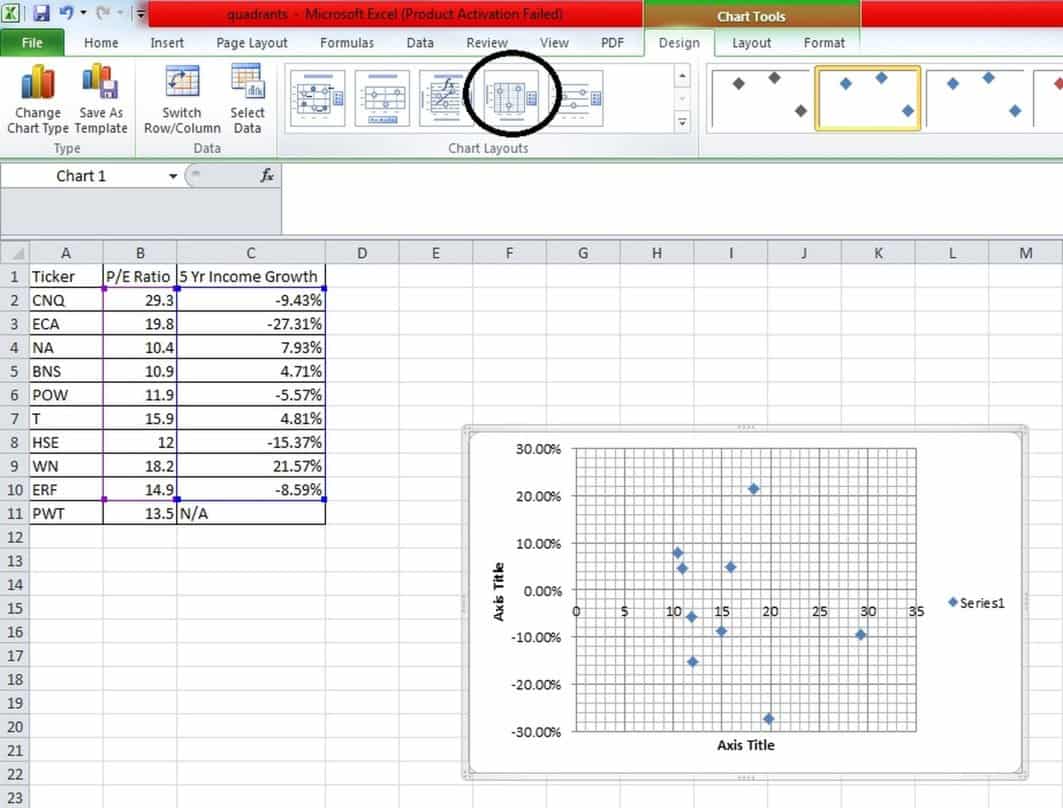
- Then, you simply have to print it and add the stock name besides each dot and you have your quadrant!
Using Dividend Stocks Rock to Facilitate Your Investing Process
If you are thinking, “Wow, that looks like a lot of work”, then you would be right.
Yes, it takes time and effort to first complete all the factor screening to create a dividend stock shopping list and then further sort for quality and consistency using company fundamentals and then quadrant analysis.
After teaching this method to many people the one consistent response was, “Interesting. I like it, but is there a way for me to just pay you to do it for me?”
And so that is why I’ve developed a membership web site that does exactly that. (Affiliate link) If you want to do it yourself, you have all the knowledge you need in this article. I gave it to your freely. You don’t need me because this is the complete recipe. Nothing held back.
However, if you want someone to do all the screening and quadrant analysis for you then I’ve built a website that does exactly that by allowing you to:
- Search through my pre-screened stock lists,
- Monitor my model portfolio performance,
- Read my stock commentary every two weeks,
- Know exactly when any company in my model portfolio provides quarterly reports,
- Benefit from my unique stock ranking system.
You can get to this website here and it simply does what I taught you here at such a low price that it really doesn’t make sense for you to do it yourself. (Affiliate link)
I hope you found the ideas in this article helpful for your dividend growth stocks investing strategy.
http://financialmentor.com/investment-advice/dividend-growth-stocks-investing/12356
http://www.dividendstocksrock.com/buildyourownportfolio/?hop=finlmentor


 Had in you invested in MO stock on Jan. 2, 1970, and left that money alone until the close of trading on Sept. 2, 2014, your return would be 431,800%, adjusted for dividends and